 |
As shown on this blog previously, I am a great lover of photography. I have experimented with a lot of different types of photography but have never taken a self portrait. I always thought it weird to sit down and take the time to take photos of my own face. However I thought it would be interesting to try it out. So above is my self portrait. For this self portrait I focused on my favourite features, my collar bone, my chin and my smile. This is not a vain self portrait however, I have also left in the scarring from my teenage acne on my right cheek and the birth mark on my neck is visible, also on the right hand side. This is a true representation of me, the good and the ugly. Hope you like it! |
Wednesday 26 January 2011
SELF PORTRAIT.
Sunday 16 January 2011
MY DESIGN WORK.
 |
One of my first tasks set in Graphic Design was to create an image that displayed an architect’s work whilst giving some information about them. The aim was to visually inform. I was given the architect Calatrava, I decided to split the image into three parts, separated with a strong black line. I went for this design because his architecture has strong lines- as shown in the image in the middle. I used his eyes as the top layer to show his ‘eye for design’. Hope you like it! |
Thursday 13 January 2011
UPDATE ON DESIGNS FOR THE FUTURE PERFECT COMPANY
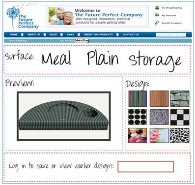 |
This is the final design of my webpage. The font is the same font that is used in my logo and on my postcard, I thought it was important to use the same font to build up a sense of brand identity. I also used the same colours used on The Future Perfect Company website to create a visual link back to The Future Perfect Company brand. I included a ‘log in’ feature which allows the customer to save all of their designs; this also increases the chance of them buying because they will be able to look back at their designs. The idea for this webpage came from Nike.com, their personalisation of trainers just seemed like such a clever idea. The idea of having something personal to you by choosing your own features is exactly what I wanted to achieve. There are two options: surface and design and there is a preview box that shows you what the design and surface you have selected looks like. If you hover over the surfaces option there is a little text box that tells you the features. This allows the customer to make an informed choice. I really like this final design as I believe it is colourful and modern, easy to understand and a really fresh idea of personalisation. What do you think ? |
Wednesday 5 January 2011
PORTRAITURE.
I love photography and one of my favourite forms of photography is portraiture.
Today my friend asked me to take some head shots of him for his university application. I set up a proper photography white backdrop, complete with lights and a reflector. Below are two of my favourite shots out of all the ones I took, I chose black and white to enhance his features and add a certain seriousness to the photos.


Today my friend asked me to take some head shots of him for his university application. I set up a proper photography white backdrop, complete with lights and a reflector. Below are two of my favourite shots out of all the ones I took, I chose black and white to enhance his features and add a certain seriousness to the photos.


Tuesday 4 January 2011
MY DESIGN.
Recently I have had the opportunity to do one of my favourite things, design. I designed a tray called ‘StakaTray’ for my client, who is coincidentally my mother. My mother owns a company called The Future Perfect Company, her company sells well designed products for people getting older. My product provides people with the exciting opportunity to have set of trays with different surfaces for different purposes that can be personalised. This solves the need for familiarity and need that arises as people get older, the StakaTray can be your dining room table, your work space, your bedside table of a surface to play.
Once I had come up with this design, I got to design the advertising. I wanted to produce something similar to the postcard design that The Future Perfect Company so that it linked in nicely.
The back of the postcard: on the left hand side is the information about my product. I used the informal handwritten font as a way of forming a relationship with the costumer; this is the technique that is used on The Future Perfect Company’s postcard. On the right hand side are pictures of my product, I took screenshots of the Prodesktop designs at different angles to show the different aspects of the trays. The divider of the postcard is exactly the same as The Future Perfect Company’s, this is the details about the company. The slogan ‘Your Life, Your Choice’ is in reference to the personalisation aspect of the tray.
The front of the postcard: I developed my logo using ‘Dafont’ and added a solid box around it so that the logo can be easily read, underneath the logo is the website of my client. The different angles of the trays on the page and their positioning give the image an almost 3D aspect. I kept the background colouring neutral so that the trays speak for themselves.
 |
| My own design, the back. |
 |
| My own design, the front. |
 |
| Original Design by TheFuturePerfectCompany.com |
Sunday 2 January 2011
THE IMPOSSIBLE ART OF LI WEI
 |
I stumbled across these images when flicking trough The Sunday Times Magazine on a lazy Sunday morning. Needless to say, they shook me straight out of my lazy state. Li Wei is the incredible artist responsible for these breathtaking images, he describes his work as 'performance art' and does not super impose the people n his images. Instead he uses a series of wires and scaffolding to retain the positions of the people in the images. |
 |
The image below has a magical quality to it. The innocent image of a young girl holding a dozen white balloons is made slightly sinister with the man standing on top of the balloons, suddenly giving the young girl an essence of power. I really enjoyed looking at these images and I am sure you will too. If you want to see any more of his images, visit this website below. |

Subscribe to:
Posts (Atom)