 |
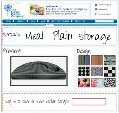
This is the final design of my webpage. The font is the same font that is used in my logo and on my postcard, I thought it was important to use the same font to build up a sense of brand identity. I also used the same colours used on The Future Perfect Company website to create a visual link back to The Future Perfect Company brand. I included a ‘log in’ feature which allows the customer to save all of their designs; this also increases the chance of them buying because they will be able to look back at their designs. The idea for this webpage came from Nike.com, their personalisation of trainers just seemed like such a clever idea. The idea of having something personal to you by choosing your own features is exactly what I wanted to achieve. There are two options: surface and design and there is a preview box that shows you what the design and surface you have selected looks like. If you hover over the surfaces option there is a little text box that tells you the features. This allows the customer to make an informed choice. I really like this final design as I believe it is colourful and modern, easy to understand and a really fresh idea of personalisation. What do you think ? |
Thursday, 13 January 2011
UPDATE ON DESIGNS FOR THE FUTURE PERFECT COMPANY
Subscribe to:
Post Comments (Atom)
No comments:
Post a Comment