 |
So, as Christmas gets nearer it is time to choose the cards you will be sending to your nearest and dearest. And whilst I was looking over the selection my family received this year, a thought occurred to me; essentially the card you send displays your personal style. Whether you go for the kittens in Santa hats or a retro graphic print- you are letting the person who receives that card know what your taste in design is. I think it is a really big decision, especially since often the cards you send to some people are the only communication you ever have with them. Personally, the cards above are my favourite for this year. They are from the V&A and can be purchased from the website (link below). I really love the graphic print style of these cards, it has a very retro feel. I have a lot of retro 50s inspired art in my bedroom so this would definitely display my personal taste in design very well. Will you be thinking more carefully next time you purchase your Christmas cards? |
Friday, 17 December 2010
BATTLE OF THE CHRISTMAS CARDS
Wednesday, 8 December 2010
SYMBOLS/BRAND INDENTS.
Recently I have been looking at design and more specifically the use of symbols. If you think about it, the fact the shapes that somebody has designed are now nationally recognised as the symbols for something i.e. peace or the underground. |

 |
In terms of brand identity, a designer could create a brand identity for a relatively new company and as they become well known soon enough that simple brand identity will be enough for a consumer to recognise the company from the symbol alone. |
 |
Sunday, 5 December 2010
CHRISTMAS IS COMING.
You know it's close to Christmas when the ad breaks are jam packed with wonderfully festive advertising campaigns. An old favourite has to be the coca-cola advert, a retro classic.
Advertising is a great way of getting people in the mood for a particular season or event, by creating the ultimate scenario that truly captures the feeling of the season/event.
The advert below is by far my favourite for this year- I LOVE this advert.
Everything about it, the cosy cottages, the snow, Jamie Oliver- everything!
http://www.youtube.com/watch?v=6BeDPNJrH9o
http://www.youtube.com/watch?v=6BeDPNJrH9o
Wednesday, 24 November 2010
SEX SELLS.
 |
| Recently I was searching the web looking for fragrances to buy my loved ones (and myself) for Christmas. On my search I stumbled across this interesting advert from Marc Jacobs. Marc Jacobs is a known designer for producing ‘sexy’ advertising so initially I was not totally surprised by this advert. However on further inspection I discovered that the muscle man using an oversized bottle to cover his delicates was Marc Jacobs himself. To me this seems strange, as though his exploiting himself to sell his products. However this advert did spur me on to go and smell the fragrance (which by the way is divine) I suppose the lesson from this advert is that sex does sell but most importantly the shock factor definitely gets you noticed. As we become more and more desensitised I wonder how far advertising companies will have to go to get our attention. Who knows, the pages of our beautiful glossy fashion magazines could resemble Page 3 in a decade or so... |
Tuesday, 23 November 2010


Saturday, 20 November 2010
PUSHING THE BOUNDARIES.
 |
I am very interested in advertising and hope to gain a career in it in the future. Because of my passion for it I am constantly on the lookout for advertising that inspires me and also that pushes the traditional boundaries. Enter United Colors of Benetton: Known for their controversial advertising that challenges social understanding and acceptance of gender, sexuality and race. Photographer Oliviero Toscani has created some absolutely briliant images that have received both praise and complaints. The pictures below and above are my favourite images from their array of different advertising campaigns. I think the images are both beautiful and thought provoking- such an important combination in advertising. |

Saturday, 30 October 2010
HALLOWEEN.
 |
A majority of the credit for this image goes to the zombie himself as this is photo from my Halloween party and he created this look himself, complete with those crazy contacts! I took photos of him throughout the night and love the way the images came out, it looks like a zombie has just stumbled into a party... I will most definitely be including the series of images in my photography book. Happy Halloween! |
Tuesday, 26 October 2010
STUDIO WORK.

Recently I did some studio work with the help of a member of the rugby team and a good friend of mine I tested a few shots. I love the soft/yellow toned lighting in these shots and although the positioning is a little awkward, the pair do look very sweet. I am hoping to get back into the studio after half term and do some more shots, along with the love and relationship theme because the lighting does add a romantic candle lit feel.

Tuesday, 19 October 2010
TRIAL OF IDENTITY
 |
| So this is just something I am trying out as a part of my surrealism/fantasy photography project. It's not the final image, but I wanted to show you the basic concept. I really like the 'wall' of faces behind the portrait - I did this edit really quickly so I will probably use a different portrait for the overlay next edit, possibly try and incorperate the faces into the skin on the face. Anyway, let me know what you think! |
LONG TIME NO BLOG!
 |
| Hello! So I have been carrying on with my surrelaism/fantasy project but decided to take a different direction. Recently I have been really inspired by fashion photography so I created this image on photoshop using diferent layers and I love the final outcome. The graphic apperance of this image is so interesting and I plan on making more images like this. I like to think this has a Andy Warhol charm to it. Comments? |
Wednesday, 29 September 2010


Tuesday, 21 September 2010
BAD ADVERTISING.
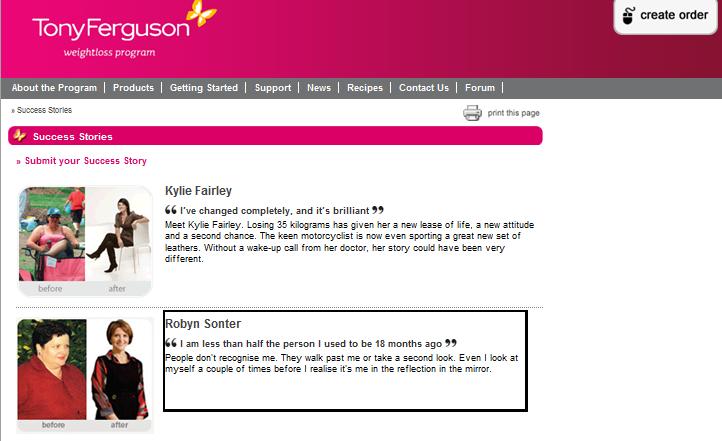 |
Walking past my local Boots yesterday I noticed an advertisement on a sandwich board which really caught my attention. It was an advertisement for Tony Ferguson's weight loss programme. The slogan "I am less than half the person I used to be" was printed next to the generic weight loss advertisement photo of a thin person holding a gigantic pair of jeans. "I am less than half the person I used to be"? I cannot be the only person who thinks this is one of the most ridiculous slogans for a weight loss company to use. Weight loss is such a challenging and sometimes traumatic thing to go through for so many people, the last thing they want to hear is that they will be 'half the person they used to be'. I realise this isn't what is intended by the slogan but it is still sloppy. |
Sunday, 19 September 2010
 |
TOPSHOP'S NEW LAYOUT.
Finally Topshop have had a revamp of their website and replaced that dated black and white polka dot themed layout with a much more visually pleasing background. The background is much cleaner with the only colour coming from the images of clothes on the women. And to be honest that is exactly what Topshop should be doing if they want to best advertise and sell their clothes.
I for one LOVE this new look of the website. Well done Topshop!
Saturday, 18 September 2010
INTERNET KILLED TELEVISION
 |
Internet killed television. Since the introduction of BBC iplayer, Youtube, ITV iplayer and Channel 4od television just hasn't been the same. I can still remember the days when we had four channels and the whole family would sit around the television to view programmes, it was a very social experience and people even named their sitting rooms 'The TV room'. Nowadays however we have the option to watch the programmes on websites and so we are often viewing them by ourselves in our bedrooms. For me personally, I would much rather view my favourite television programmes at a later date on my laptop because it means I can do other things at the same time. I watch BBC iplayer, Channel 4o and ITV iplayer whilst doing my makeup, getting dressed for college and doing my work- such as I am doing now. |
 |
The layout of the screen shown above is how I always have my computer screen. On the left hand side I have some sort of programme playing- be it Channel 4od, ITV iplayer or BBC iplayer- and on the right hand side I have whatever work I am doing at the time. When I go to Uni I will be quite happy to not have a television and I will just have my laptop so that I can keep up with all of the latest television shows and if I then moved out by myself I can definitely see the possibility of not buying a television even then. What do you think? Is the internet taking over? |
Monday, 13 September 2010
COMMUNICATION AND CULTURE

What does this picture communicate to you?
This photo is one of the most shocking photos taken from the Vietnam war. And according to my college teacher this photo alone stopped the Vietnam war. The girl in the middle of the photo is covered in Napalm, an orange jelly like substance that burns through the skin if it happens to come into contact, and unfortunately for this girl it did.
The idea of a picture speaking such horrors and truths of a situation that it can stop something as immense as a war is so incredible. Whether it did or not I don't actually know. But I find this image both captivating and horrifying nonetheless.
Sunday, 12 September 2010
THE CLONING PROJECT.


WANTED: MAN IN RED SUIT WITH WHITE BEARD.
 |
| NARS: These beautiful palettes are so appealing to me. I love the idea of having all of my makeup (with the exception of mascara, eyeliner and foundation) in one handy container. The colours are also so divine! I have already got a few Nars products and find them to be of a very good quality. Fingers crossed that man in the red suit adds me to the good list! |

HDR PHOTOGRAPHY.
 |
| I really love the effect of the HDR on these photos. The colours and textures are so intense. I am very pleased with how these photos came out. |

 |

Title 1
I decided to start a blog to document my inerests and thoughts.
At the age of 17 I am a halfway adult and find myself searching for an outlet, something to express myself through and something to keep my mind ticking.
Que BlogSpot.
At the age of 17 I am a halfway adult and find myself searching for an outlet, something to express myself through and something to keep my mind ticking.
Que BlogSpot.
Subscribe to:
Comments (Atom)